In this document:
Introduction
Copy these CSS snippets to help with hiding headers, text and icons. In addition, find other ways to customize the Booking Calendar in the Style with CSS Snippets guide.
Make sure to add the CSS in SSA Settings > Styles > Custom CSS field. If you’d like to learn more, see our guide on adding custom CSS to Simply Schedule Appointments.
“What type of appointment are you booking?” Header

Moreover, this header appears at the beginning of the Booking Calendar flow if you have multiple Appointment Types to choose from. Use this CSS to hide this header:
/* Hide the 'What type of appointment are you booking?' header */
.book-type .md-title.ssa-type-header {
display: none;
}
Appointment Duration
By default, the Appointment Duration displays under the Appointment Type name and on the Booking Confirmation Screen.

Use this CSS to hide the Appointment Duration on the Booking Calendar:
/* Hide the Appointment Duration */
body .appointment-duration {
display: none;
}
This CSS doesn’t affect Notification messages. You can use the Notification Settings to remove the Appointment Duration from the notifications..
Hide Dash Next to Payment Amount
If you have Payments enabled and have hidden the Appointment duration, then your Booking Calendar will look like this:

To get rid of the dash before the payment amount, add this CSS:
/* Hide the dash next to payment amount (used when you're hiding the appointment duration) */
body .divider {
display: none;
}
Appointment Date & Time Selection Screens
Timezone

Use this CSS snippet to hide the timezone on the Appointment Date & Time selection screens.
/* Hide the timezone on the appointment selection screens */
body .booking .booking-header .timezone {
display: none;
}
Appointment Start and End Time
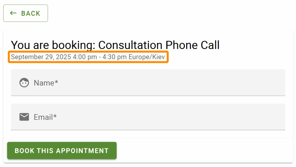
If you’re hiding the Appointment Duration, you may also need to hide the Start and End Time of the appointment on the Booking Form and Confirmation Screen.

Use this CSS to remove the Start and End Times components- You could also use each individually to only remove Start or End Time.
The Whole Shebang: Start Time + Divider + End Time + Timezone
/* Hide the time slot information on the confirmation and booking form screens */
body .confirm .md-subhead {
display: none;
}
A. Start Time: Date + Time
/* Hide the start date and time on the confirmation and booking form screens */
body .confirm .appointment-start-time {
display: none;
}
B. Start Time: Date Only
/* Hide the start date on the confirmation and booking form screens */
body .confirm .appointment-start-d {
display: none;
}
C. Start Time: Time Only
/* Hide the start time on the confirmation and booking form screens */
body .confirm .appointment-start-t {
display: none;
}
End Time
/* Hide the end time on the confirmation and booking form screens */
body .confirm .appointment-end-time {
display: none;
}
Start and End Divider
/* Hide the time divider on the confirmation and booking form screens */
body .confirm .appointment-time-divider {
display: none;
}
Timezone Only
/* Hide the timezone on the booking form and confirmation screens */
body .confirm .appointment-timezone {
display: none;
}
This CSS doesn’t affect Notification messages. You can use the Notification Settings to remove the Start and End time from the notifications.
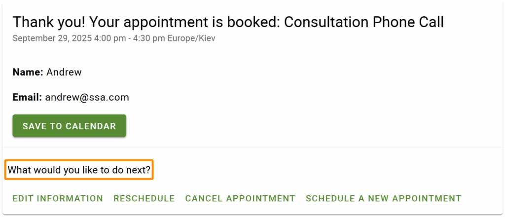
“What would you like to do next?” on Confirmation Screen

Use this CSS to hide this heading on the confirmation screen:
/* Hide the 'What would you like to do next?' header on the confirmation screen */
.confirm .appointment-actions .md-subheading {
display: none;
}
Time Categories
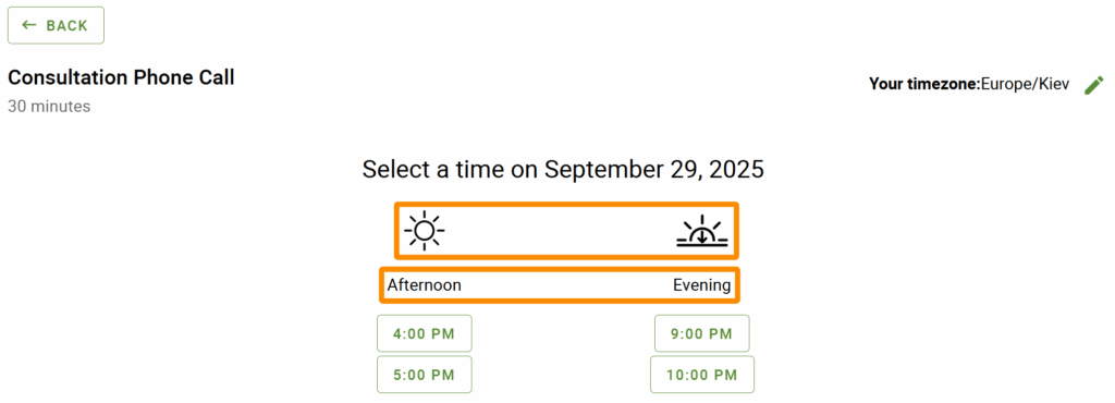
Each time slot in the booking calendar gets categorized into one of four sections pertaining to the time of day: Night, Morning, Afternoon and Evening.

Category Subheadings
Use this CSS to then hide those subheadings:
/* Hide the Night, Morning, Afternoon, and Evening subheadings */
.time-select .md-column-center .md-subheading {
    display: none;
}
If you’d like to change what the subheadings say instead, follow this our ‘Change Phrasing’ guide.
Icons
In addition, to remove the icons, use this CSS:
/* Hide the Night, Morning, Afternoon, and Evening icons */
.time-select .time-listing-icon {
  display:none;
}
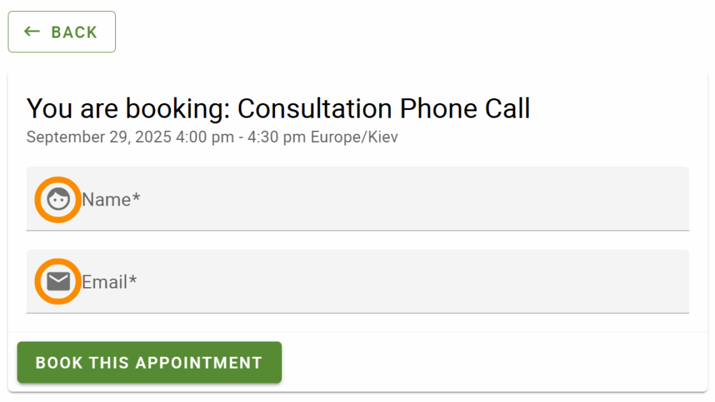
Field Icons in the Booking Form

Each field on the booking form displays an icon on the left side. Use this CSS to hide the icons on the booking form:
/* Hide the icons for the fields in the booking form screen */
.confirm i.material-icons {
display: none;
}

.mdc-floating-label {
left: 12px !important;
}Related Guides
-

Styling the Booking Calendar
-

Adding Custom CSS Stylesheets
-

Custom Email Styles for Notifications
-

Support Policy

