In this document:
- Introduction
- What type of appointment are you booking? Header
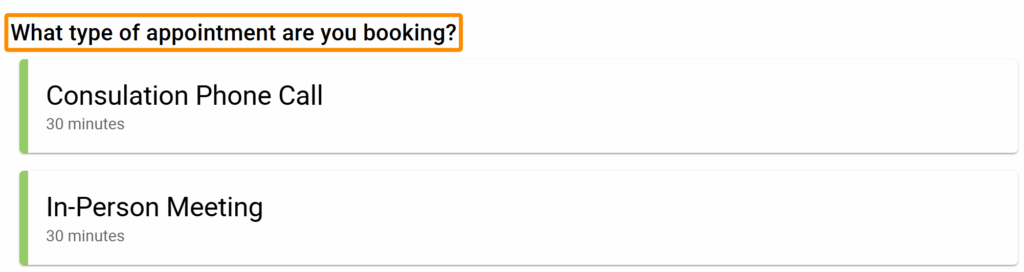
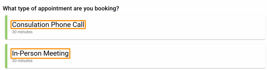
- Appointment Type Names
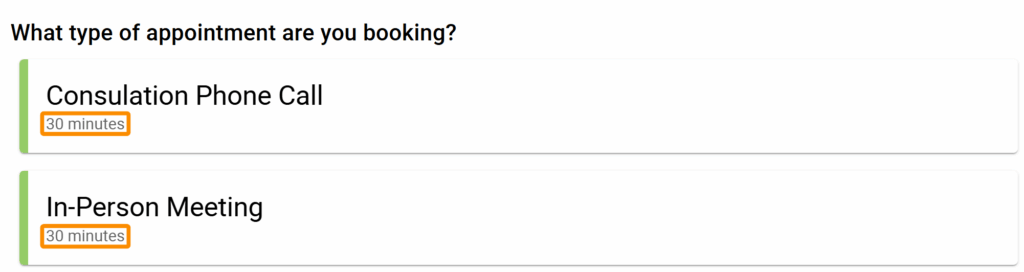
- Listed Appointment Type Duration
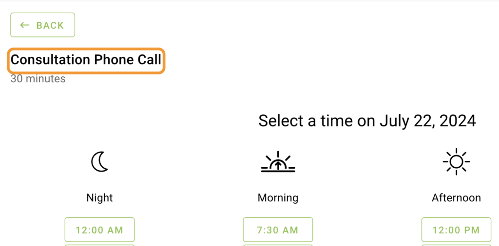
- Appointment Type Title for Date and Time Screens
- Appointment Type Duration for Date and Time Screens
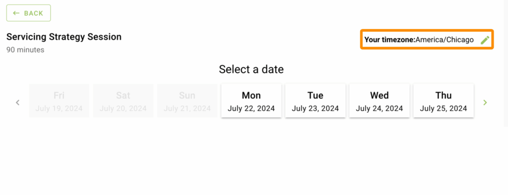
- Timezone Information
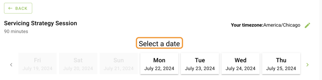
- ‘Select a Date’ Header
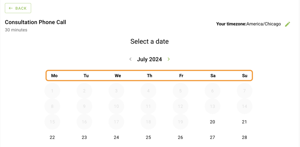
- Monthly View Day Names
- Format and Colors for Weekly and Monthly Views
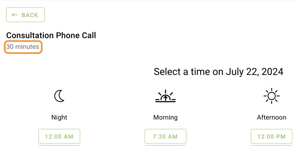
- ‘Select a Time on …’ Header
- Time Categories
- Format and Colors For Time Slots
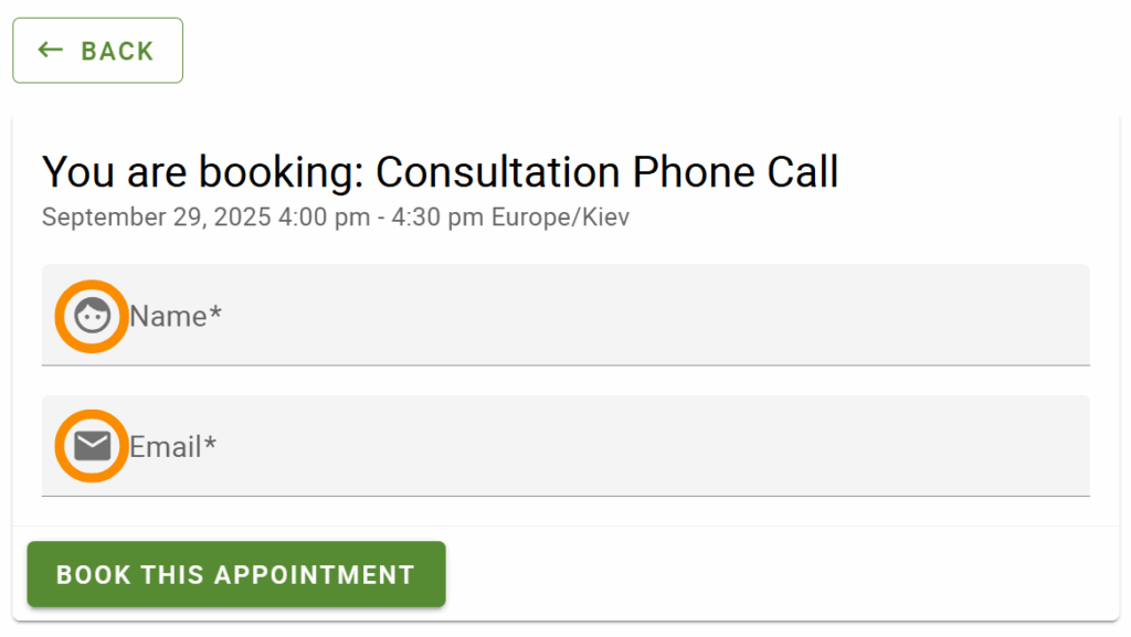
- ‘You are booking: …’ Header
- Date and Time Subheading on Booking Form
- Booking Form Instructions
- Field Icons on Booking Form
- Field Titles/Labels on Booking Form
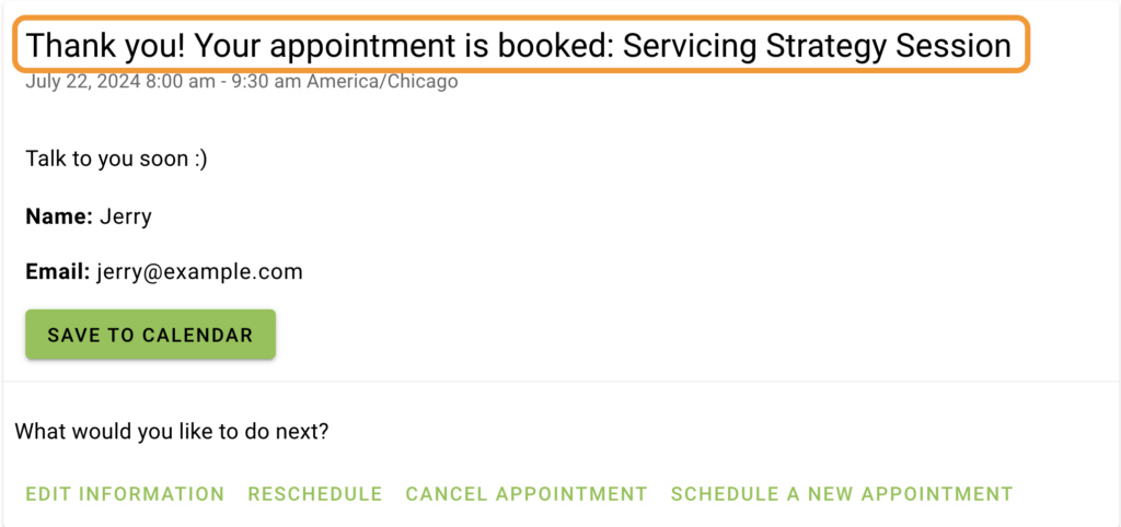
- ‘Thank you! Your appointment is booked: …’ Header
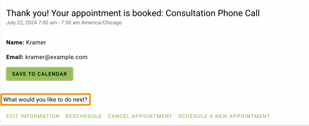
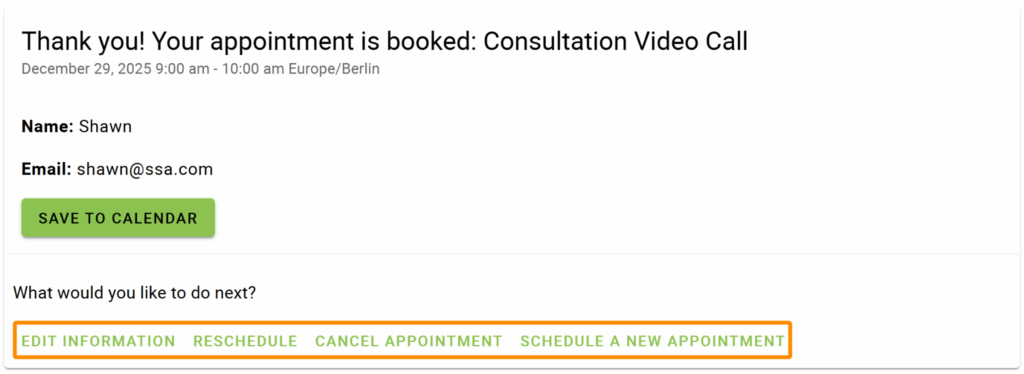
- ‘What would you like to do next?’ Header
- Appointment Action buttons
- Highlighted Text
Introduction
This is a growing list of CSS snippets to help you change the font sizes of the headings and subheadings in the Booking Calendar. Find other ways to customize the Booking Calendar in the Style with the CSS Snippets guide.
Make sure to add the CSS in SSA Settings > Styles > Custom CSS field. If you’d like to learn more, see our guide on adding custom CSS to Simply Schedule Appointments.
CSS Properties Key
- font-size: Change the size of the text.
- line-height: Change the height of the text, and adjust the space between lines.
- color: Change the color of the text.
- background: Change the color behind the text.
- fill: Change the color of an SVG (used for icons only).
- max-width: Change the size of an element (used for icons only).
What type of appointment are you booking? Header
/* Format "What type of appointment are you booking" header */
.book-type .booking-header .ssa-type-header {
font-size: 20px;
color: red;
}
Appointment Type Names
/* Format listed Appointment Type Names */
.book-type .book-type-single .md-card .md-title {
font-size: 24px;
color: red;
}
On Hover: Appointment Type Names
/* Format listed Appointment Type names text on hover */
.md-card.md-with-hover.selectable:hover h2 {
color: blue;
}
Listed Appointment Type Duration
/* Format listed Appointment Type duration text */
.book-type .book-type-single .md-card .md-subhead {
font-size: 14px;
color: red;
}
On Hover: Listed Appointment Type Duration
/* Format listed Appointment Type duration on Hover */
.md-card.md-with-hover.selectable:hover h3 {
color: purple;
}
Appointment Type Title for Date and Time Screens
/* Format Appointment Type Title for choosing a date and time screens */
.booking .md-layout .md-title {
font-size: 25px;
color: red;
}
Appointment Type Duration for Date and Time Screens
/* Format Appointment Type Title subheading for choosing a date and time screens */
.booking .md-subheading .appointment-duration {
font-size: 20px;
color: red;
}
Timezone Information
/* Format the Timezone information */
.booking .timezone,
.booking .timezone-local {
font-size: 16px;
color: red;
}
‘Select a Date’ Header
/* Format 'Select a date' headline */
.date-select-headline {
font-size: 24px;
color: red;
}
Monthly View Day Names
/* Format Daily headers in the monthly view (Mo, Tu, We, etc.) */
.booking ul.week {
font-size: 18px;
color: red;
}
Format and Colors for Weekly and Monthly Views
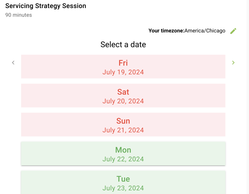
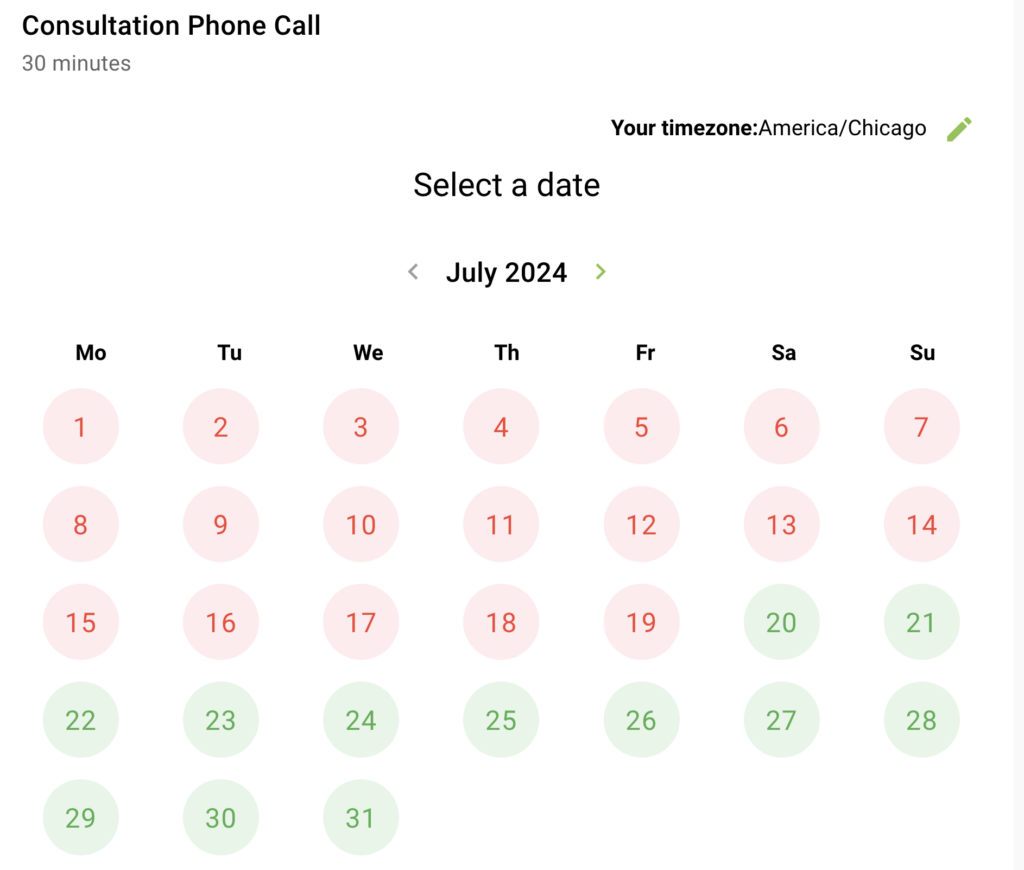
Format Available Dates
/* Format AVAILABLE dates */
/* Change the background color and font color */
.book-day button.md-whiteframe.selectable{
	background: #E8F5E9;
	color: #4CAF50;
}

/* Change the font-size for the monthly view dates (1,2,3,...31) and the weekly view full date info (July 15, 2021) */
.book-day button.md-whiteframe.selectable .md-body-1 {
    font-size: 20px;
}

/* Change the font-size for the weekly view day (Fri, Sat, Sun, etc.) */
.book-day button.md-whiteframe.selectable .md-title {
    font-size: 24px;
}
/* ------------------------- */
On Hover: Available Dates
/* Format AVAILABLE dates when hovering */
.book-day button.md-whiteframe.selectable:not([disabled]):hover {
	background: purple;
	color: white;
}
/* ------------------------- *//* Format UNAVAILABLE dates */
/* Change the background color and font color */
.book-day button.md-whiteframe.disabled:not(.passive) {
background: #FFEBEE;
color: #F44336;
}
/* Change the font-size for the monthly view dates (1,2,3,...31) and the weekly view full date info (July 15, 2021) */
.book-day button.md-whiteframe.disabled .md-body-1 {
font-size: 20px;
}
/* Change the font-size for the weekly view day (Fri, Sat, Sun, etc.) */
.book-day button.md-whiteframe.disabled .md-title {
font-size: 24px;
}
/* ------------------------- */‘Select a Time on …’ Header
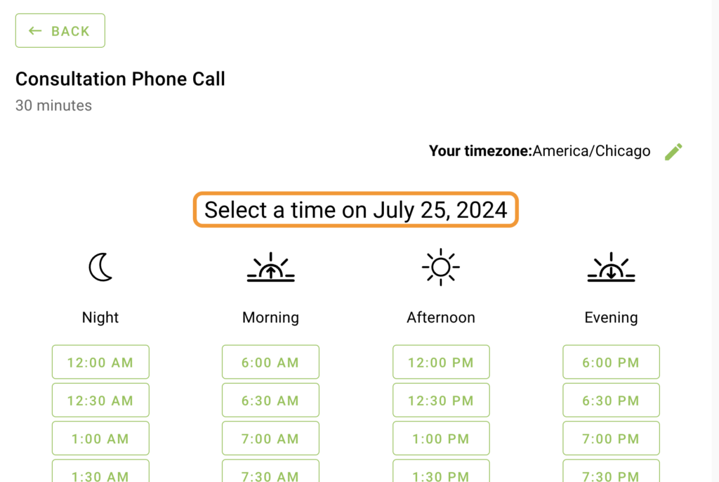
/* Format 'Select a time on ...' headline */
.time-select .md-headline{
font-size: 24px;
color: red;
}
Time Categories
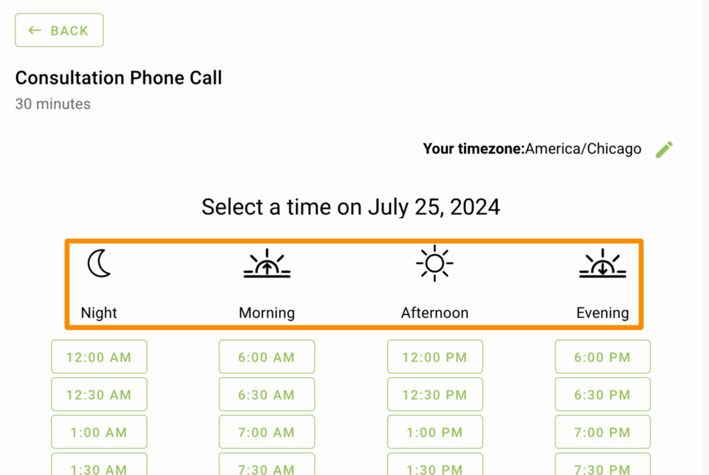
/* Format the Time Categories (Morning, Night, etc) */
.time-select .md-subheading {
font-size: 18px !important;
color: red;
}
Time Category Icons
/* Format the time category icons on the time selection screen */
.time-listing-icon {
fill: red;
max-width: 100px;
}
Format and Colors For Time Slots
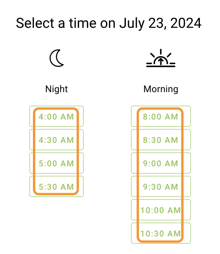
Format the Time Slot Fonts, Color and Sizes
/* Format time slots */
html .time-select .mdc-button:not(:disabled){
    background: #E8F5E9;
    color: #4CAF50;
    padding: 30px;
    margin: 5px;
 }


.time-listing .mdc-button{
	font-size: 20px;
}

/* ------------------------- */
On Hover: Format the Colors and Sizing
/* Format time slots on hover */
html .time-select .mdc-button:not(:disabled):hover,
html .time-select .mdc-button:not(:disabled):focus {
     background: white;
     color: black;
     padding: 30px;
     margin: 5px;
 }
/* ------------------------- */
‘You are booking: …’ Header
/* Format the "You are booking:..." headline */
.confirm .md-title {
font-size: 24px;
color: red;
}
Date and Time Subheading on Booking Form
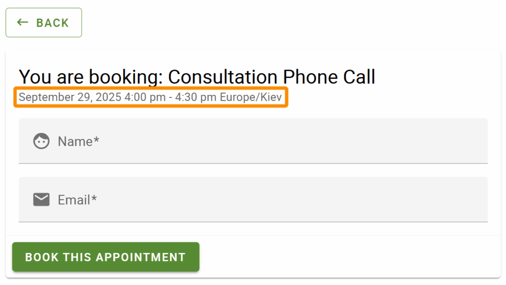
/* Format the date and time of the appointment on the booking form */
.md-card-header-text p {
color: blue;
font-size: 12px;
}
Booking Form Instructions
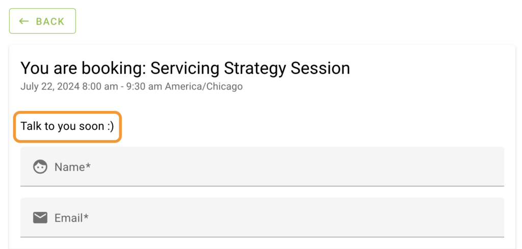
/* Format the Instructions text */
.md-card-content p {
font-size: 16px;
color: red;
}
Field Icons on Booking Form
/* Format the field label icons */
body .md-card-content i {
  color: purple !important;
  font-size: 36px;
  margin: 9px;
  margin-right: 16px;
  margin-left:0px;
}

/* Shift field labels to match icon new size */
body .md-input-container .md-icon:not(.md-icon-delete)~label {
left: 40px;
}
body .md-input-container .md-icon:not(.md-icon-delete)~.md-input {
margin-left: 40px;
}

/*------------------------*/
Field Titles/Labels on Booking Form
/* Format the customer information field labels */
.mdc-text-field:not(.mdc-text-field--disabled) .mdc-floating-label,
.md-card-content legend.md-subheading {
 color: red;
 font-size: 22px;
}
‘Thank you! Your appointment is booked: …’ Header
/* Format the "Thank you! Your appointment is booked:..." headline */
.confirm.cust-info .md-title{
font-size: 24px;
color: red;
}
‘What would you like to do next?’ Header
/* Format the "What would you like to do next?" headline */
.appointment-actions .md-subheading {
font-size:14px;
color: red;
}
/* Format the Appointment Actions button */
.appointment-actions .mdc-touch-target-wrapper .md-button{
font-size: 14px !important;
color: red;
}
Highlighted Text
Change the color of the text and background color when any text in the booking calendar is highlighted. Use this CSS to change the highlight styling:
/* Change the color of the text and background color when any text in the booking calendar is highlighted. */
.booking-app ::selection {
background: purple !important;
color: yellow !important;
}Related Guides
-

Adding Custom CSS Stylesheets
-
Custom Email Styles for Notifications
-
Support Policy
-
White Label Admin with CSS