In this document:
Introduction
In this guide, we want to show you how to ‘White Label’ the plugin. This isn’t a complete white-label solution but it will remove most of our branding assets. To do this, we’ll use a couple of CSS snippets to hide our logos and Foxy’s images from the Admin App.
For this to work out properly, you’ll need to create a new custom.css file in the theme. Here’s a guide with more information on how to add it: Add Admin App Custom CSS.
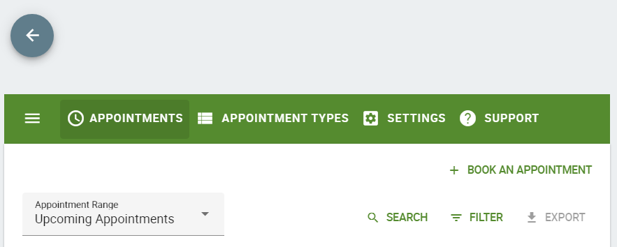
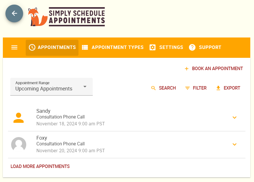
SSA Logo
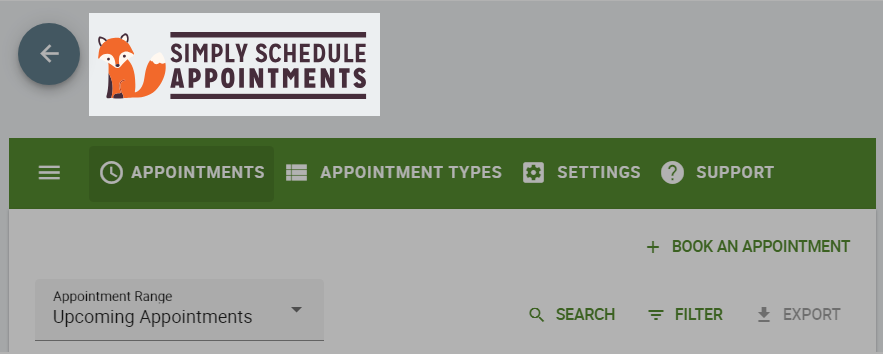
To hide the logo add this CSS snippet to your custom.css file:
/* Hide SSA Logo */
.app-header img {
    display: none !important;
}
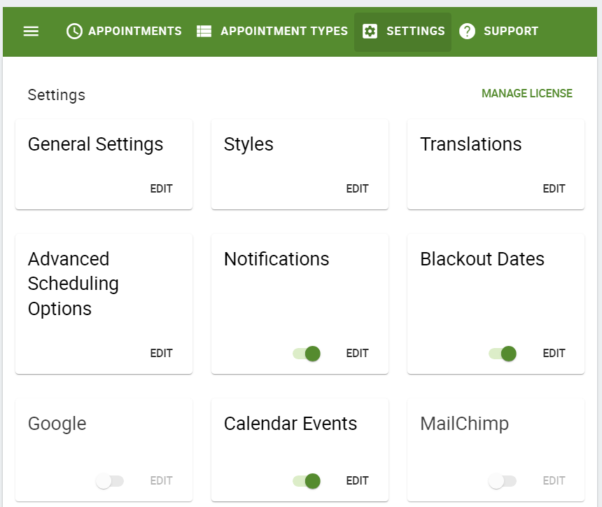
Settings’ Images with Foxy
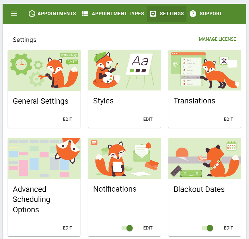
To hide Ms. Foxy’s glamour shots, add this CSS to your custom.css file:
/* Hide Settings Images of Foxy */
.md-card.settings .md-card-media {
    display: none !important;
}
This CSS makes the admin settings full-width and removes the sidebar:
.md-layout.side-settings-col.md-column {
display: none;
}

@media screen and (min-width: 960px){
.md-layout.main-settings-col{
flex-basis: 100%;
max-width: 100%;
}
}
You can remove the Contact Support Button under the Support tab if you’re white-labeling for a client. This will ensure that they contact you whenever they need any help.
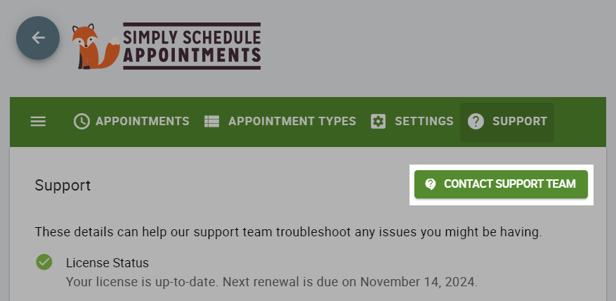
To hide the ‘Contact Support Team’ button:
div#contact-team {
    display: none;
}
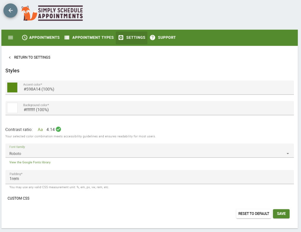
Change the Background and Accent Color of the Admin App
Switch out the word orange for your desired accent color.
The word tan for your desired shadows.
The word ivory for your desired background color.
The word maroon for your desired link colors.
/* Set new color variables */
:root {
  --ssa-accent: orange;
  --ssa-shadows: tan;
  --ssa-light: ivory;
  --ssa-dark: maroon;
}
/* Changing the accent color of the admin app */

/* Main toolbar */
  .md-toolbar.md-primary.main-app-toolbar,
  .md-toolbar .md-primary main-app-toolbar .material-icons{
    background: var(--ssa-accent);
}

.main-app-toolbar i.material-icons.md-icon.mdc-theme-name--default {
    color: var(--ssa-light) !important;
}

/* Buttons */
button.mdc-ripple-upgraded.mdc-button.md-raised.mdc-button--raised.mdc-theme-name--default,
.mdc-fab.mdc-theme-name--blue-grey{
    color: var(--ssa-light) !important;
    background: var(--ssa-accent);
}

div#contact-team .material-icons.mdc-button__icon,
span.mdc-fab__icon.material-icons{
    color: var(--ssa-light) !important;
}

.cov-date-monthly i.material-icons.md-icon.mdc-theme-name--on-primary.md-size-2x {
    color: white !important;
}

/* Debug logs, Availability Detective, Google Calendar */
.support-debugger .support-debugger-log-container{
	background: var(--ssa-light) !important;
}

.cov-date-monthly,
.md-toolbar.foxy-toolbar.md-primary.mdc-theme-name--default.md-theme-default,
.md-toolbar.foxy-toolbar.md-primary.mdc-theme-name--default.md-theme-default button{
	background: var(--ssa-accent) !important;
}

/* Support Debugger, Team, etc */
.foxy-tabs .mdc-tab .mdc-tab__ripple:after,
.foxy-tabs .mdc-tab .mdc-tab__ripple:before {
	background-color: var(--ssa-accent);
}
.foxy-tabs .mdc-tab--active .mdc-tab__text-label {
	color: var(--ssa-accent);
}
.foxy-tabs .mdc-tab-indicator .mdc-tab-indicator__content--underline {
	border-color: var(--ssa-accent);
}

.mdc-switch:enabled .mdc-switch__track:after,
.mdc-switch:enabled:focus:not(:active) .mdc-switch__track:after{
	background: var(--ssa-shadows) !important;
}
.mdc-switch.mdc-switch--selected:enabled .mdc-switch__handle:after,
.mdc-switch.mdc-switch--selected:enabled:focus:not(:active) .mdc-switch__handle:after {
	background: var(--ssa-accent) !important;
}

/* Changing the green text */
span.mdc-button__label,
span.mdc-floating-label.mdc-floating-label--float-above,
span.mdc-select__dropdown-icon,
.ssa-guides .link{
    color: var(--ssa-dark);
}

a.link, button.link,
.mdc-select2.mdc-select2--has-value label,
.mdc-select:not(.mdc-select--disabled) .mdc-floating-label--float-above,
.mdc-text-field:not(.mdc-text-field--disabled) .mdc-floating-label {

	color: var(--ssa-dark) !important;
}

/* Material icon colors, checkboxes, radio buttons */
.material-icons, i.material-icons.md-icon.mdc-theme-name--light-green.md-primary.md-size-2x,
.mdc-checkbox__background{
    color: var(--ssa-accent) !important;
}

/* Revision History */
.ssa-accordion-item-header:active, .ssa-accordion-item-header:focus, .ssa-accordion-item-header:hover {
    background: var(--ssa-light) !important;
}

.chat-bubble.md-theme-light-green[data-v-2c07adec] {
    border-color: var(--ssa-accent) !important;
}

.ssa-accordion-item-header{
			border: 1px solid var(--ssa-dark);
}

.md-card-actions .mdc-switch.mdc-theme-name--default{
	--mdc-switch-selected-handle-color: var(--ssa-accent);
    --mdc-switch-selected-focus-handle-color: var(--ssa-accent);
    --mdc-switch-selected-pressed-handle-color: var(--ssa-accent);
    --mdc-switch-selected-hover-handle-color: var(--ssa-accent);
    --mdc-switch-selected-track-color: var(--ssa-shadows);
    --mdc-switch-selected-focus-track-color: var(--ssa-shadows);
    --mdc-switch-selected-hover-track-color: var(--ssa-shadows);
    --mdc-switch-selected-pressed-track-color: var(--ssa-shadows);
    --mdc-switch-selected-focus-state-layer-color: var(--ssa-shadows);
    /* --mdc-switch-selected-pressed-state-layer-color: #dcedc8; */
    --mdc-switch-unselected-handle-color: var(--ssa-light);
    --mdc-switch-unselected-hover-handle-color: var(--ssa-light);
    --mdc-switch-unselected-focus-handle-color: var(--ssa-light);
    --mdc-switch-unselected-pressed-handle-color: var(--ssa-light);
}

/* Changing Settings cards' background and removing images */
.settings-list-item .md-card.settings .md-card-media {
    background: var(--ssa-shadows);
	height: 1em;
}

.settings-list-item .md-card.settings .md-card-media img {
	display: none;
}

.settings-list-item .md-card.disabled {
	opacity: .5;
}

/* Changing the background color of the admin app */
div#wpwrap #ssa-admin-app {
    background: var(--ssa-light);
}

/* Changing the loading icon color */
		.mdc-circular-progress__indeterminate-circle-graphic {
			stroke: var(--ssa-accent) !important;
}Related Guides
-

Adding Custom CSS Stylesheets
-
Custom Email Styles for Notifications
-

Styling the Booking Calendar
-
Helpful Customization Guides