In this document:
Introduction
In this guide, we’ll share some CSS so that you can organize the appointment types into columns whenever you use the [ssa_booking] shortcode, which displays the Appointment Type list.
Find other ways to customize the Booking Calendar in the Style with the CSS Snippets guide.
Make sure to add the CSS in SSA Settings > Styles > Custom CSS field. If you’d like to learn more, see our guide on adding custom CSS to Simply Schedule Appointments.
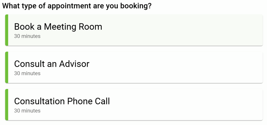
Default List of Appointment Types
By default, the [ssa_booking] shortcode shows the appointment types in a single column. But, using the CSS listed below, you can change that to two or three columns.
Display the Appointment Type List In Two Columns
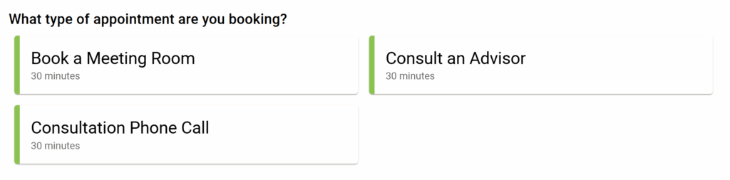
Desktop and tablet users will see two columns, and mobile users will see a single column.
@media screen and (min-width: 500px){
/* Change direction of appointment type listings into a row and wrap the overflow */
.book-type > div:last-child {
display: flex;
flex-direction: row;
flex-wrap: wrap;
}

/* Set each appointment type listing to take up half of the book-type container */
.book-type > div > .book-type-single {
flex: 0 0 50%;
}
}

/* Set the 'What type of appointment are you booking?' header to take up 100% of the book-type container */
.book-type > div > .booking-header {
flex: 100%;
}
Display the Appointment Type List In Three Columns
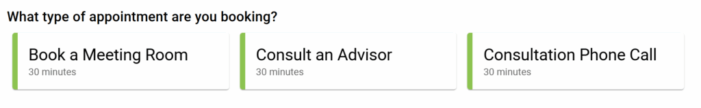
Desktop and tablet users will see three columns, and mobile users will see a single column.
@media screen and (min-width: 500px){
/* Change direction of appointment type listings into a row and wrap the overflow */
.book-type > div:last-child {
display: flex;
flex-direction: row;
flex-wrap: wrap;
}

/* Set each appointment type listing to take up half of the book-type container */
.book-type > div > .book-type-single {
flex: 0 0 33%;
}
}

/* Set the 'What type of appointment are you booking?' header to take up 100% of the book-type container */
.book-type > div > .booking-header {
flex: 100%;
}Related Guides
-

Helpful Customization Guides
-

Custom Email Styles for Notifications
-
Styling the Booking Calendar
-
Support Policy
