In this document:
Introduction
Copy and paste any of the following CSS snippets into your SSA plugin to adjust the layout and learn about formatting the time slots to your liking. Or, find other ways to customize the Booking Calendar in the Style with CSS Snippets guide.
Make sure to add the CSS in SSA Settings > Styles > Custom CSS field. If you’d like to learn more, see our guide on adding custom CSS to Simply Schedule Appointments.
Booking Flow
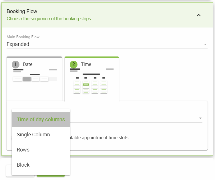
The Booking Flows feature allows each Appointment Type to have its own sequence of Views or screens for its booking form. Each View also comes with a few options to customize the layout of each screen.
The Views currently offered are:
- Time of Day columns – Displays all time slots by their time of day category, e.g., Morning, Afternoon, Evening.
- Single columns – Displays all time slots in a single column without the time category.
- Rows – Displays all time slots in a row format by their time of day category, e.g,. Morning, Afternoon, Evening.
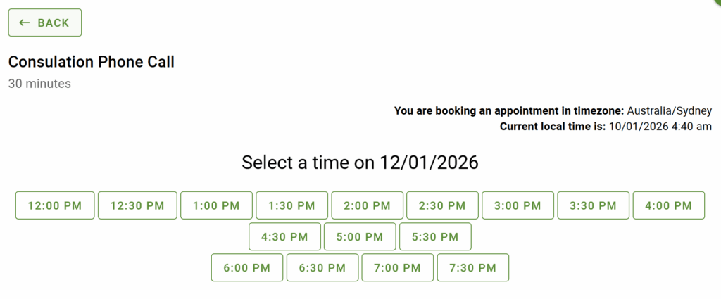
- Blocks – Displays all time slots in a block format without the time category.
These flows can really save you time when it comes to finding and using CSS. Make sure to check them out!
Change the Date and Time Format
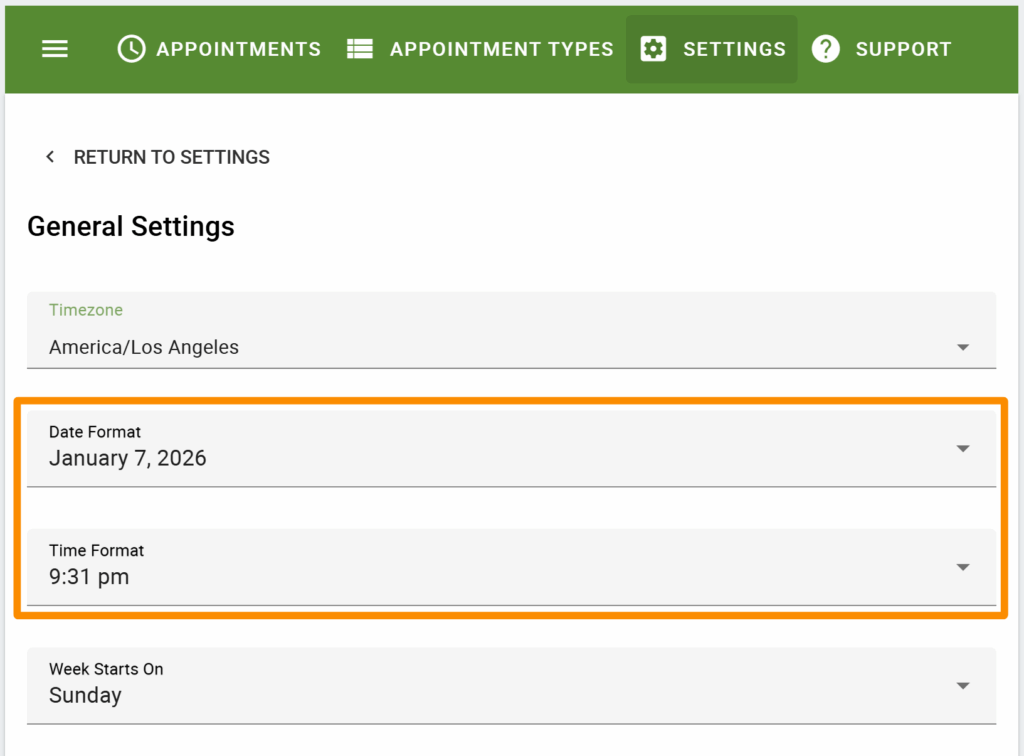
To change how the dates and times are written within the slots, go to Simply Schedule Appointment Settings > General Settings and use the corresponding dropdowns to make the changes.
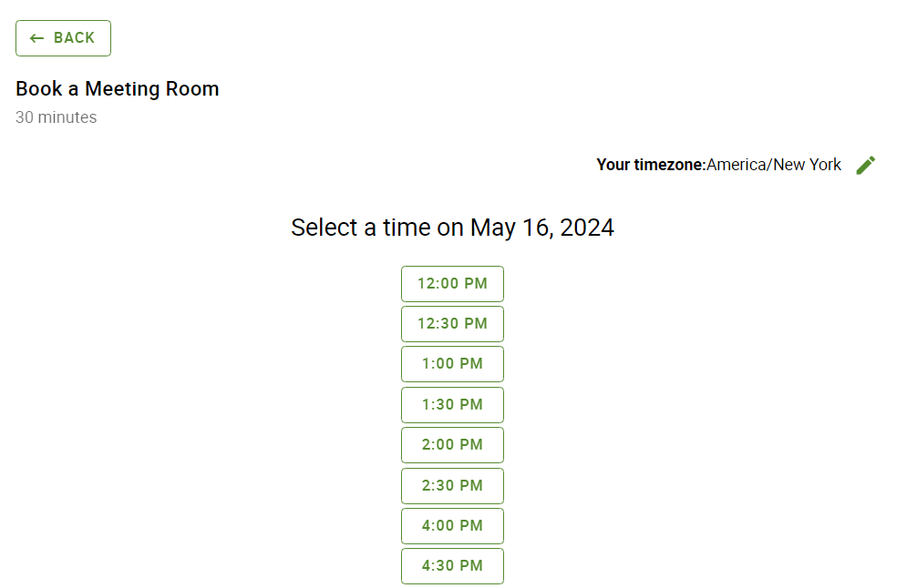
Time Slots In A Single List (And Hide Time Categories)
By default, the Booking Calendar will have separate columns sorting the time slots: morning, afternoon, evening, and night. Use this CSS to display the time slots as a single list:
/* Display the time slots as a single list */
.time-select .md-headline + .md-layout.md-align-center {
  flex-direction: column;
}

.time-selection-col-header {
  display: none;
}

.time-listing-icon {
  display: none;
}

ul.time-listing {
  padding-bottom: 0;
}
To hide only the time category headings or icons, visit our other guide on hiding icons and text.
Time Slots in Rows
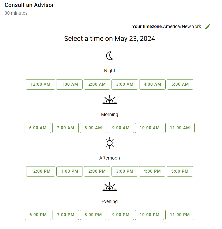
Use this CSS to sort the time slots into four separate rows instead of columns:
/* Sort the time slots into four separate rows (instead of columns) */
.time-select .md-headline + .md-layout.md-align-center {
  flex-direction: column;
}

ul.time-listing {
  justify-content: center;
  display: flex;
  flex-wrap: wrap;
}
/* ---------------------------------------- */
Time Slots in a Row (And Hide Time Categories)
Use this CSS to combine all of the columns into a single row and remove the Night, Morning, Afternoon, and Evening icons, formatting the time slots accordingly:
/* Display the time slots as a single list in a row */
.time-select .md-headline + .md-layout.md-align-center {
  display: block;
}

.time-selection-col-header {
  display: none;
}

.time-listing-icon {
  display: none;
}

ul.time-listing {
display: inline;
  padding-bottom: 0;
}

ul.time-listing li {
display: inline-block;
}

.md-layout.md-column.md-column-center {
  display: inline;
}
/* ---------------------------------------- */
Related Guides
-

Styling the Booking Calendar
-

Helpful Customization Guides
-

Custom Email Styles for Notifications
-

Support Policy

