In this document:
Introduction
In this guide, we’re reviewing the Expanded Flow sequence of Views for the Simply Schedule Appointments booking form.
Learn about the Booking Flow settings for Appointment Types.
Expanded Booking Flow
The Expanded Booking Flow shows the Date Selection screen followed by the Time selection screen before getting to the final customer information screen in the booking form.
This Flow is recommended when you have a large number of time slots for users to choose from, since the Time Selection View gives ample space to display them.
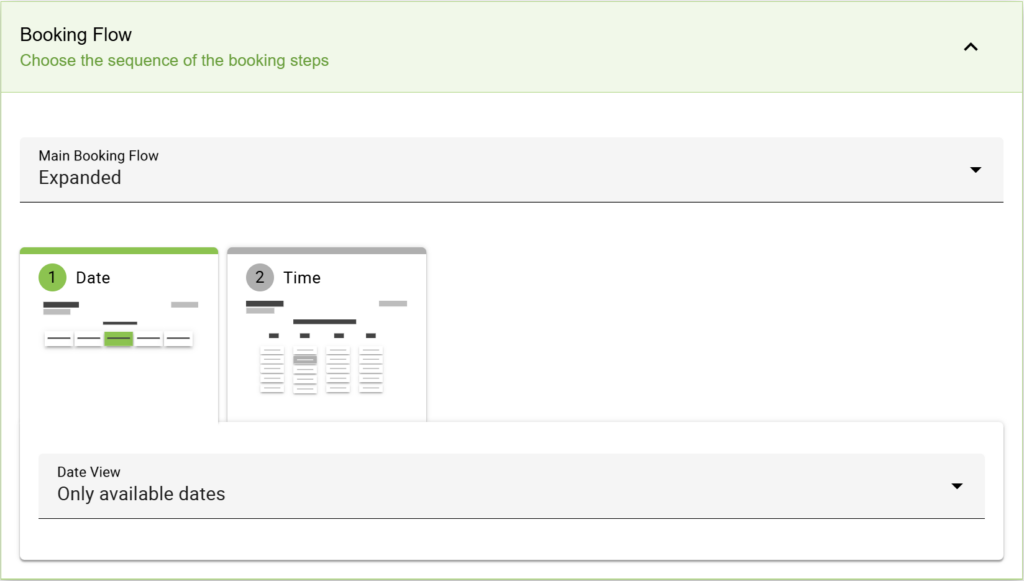
For Business Edition users who are using the Team Booking and/or Resources features and selected the User Preference option within the Appointment Type settings, you enable a new step in the Booking Flow.
In the Expanded Booking Flow, you can choose the view to display the Unique Resource Group and/or Team Member options.
Resources and Team View
Only applicable to Business Edition Users
Adjust the content layout of the Resources and Team View in the booking form.
Dropdown List
Using the Dropdown List view, you can show user preference selections for Resources, Team Members, or both in the dropdown.
The Radio Buttons view lets you display user preference selections for Resources, Team Members, or both as radio options.
Date View
Adjust the content layout of the Date View in the booking form.
Weekly
The Weekly View is best when you expect customers to book the nearest date and time. It displays the next 7 days of the week, starting with today, and gives the user the option to move through the weeks using arrows.
For example, a dog adoption center would want the new owners to book ASAP to pick up their new pet.
Depending on how much space your theme/page layout gives the booking calendar, it could show the dates horizontally or vertically.

Monthly
The Monthly View is best when you expect customers to book dates further away from the current date. This displays the calendar month containing the next available date.
For example, a busy wedding photographer has clients booking months in advance and needs people to easily navigate and get an overhead view of the overall availability.
Only Available Dates
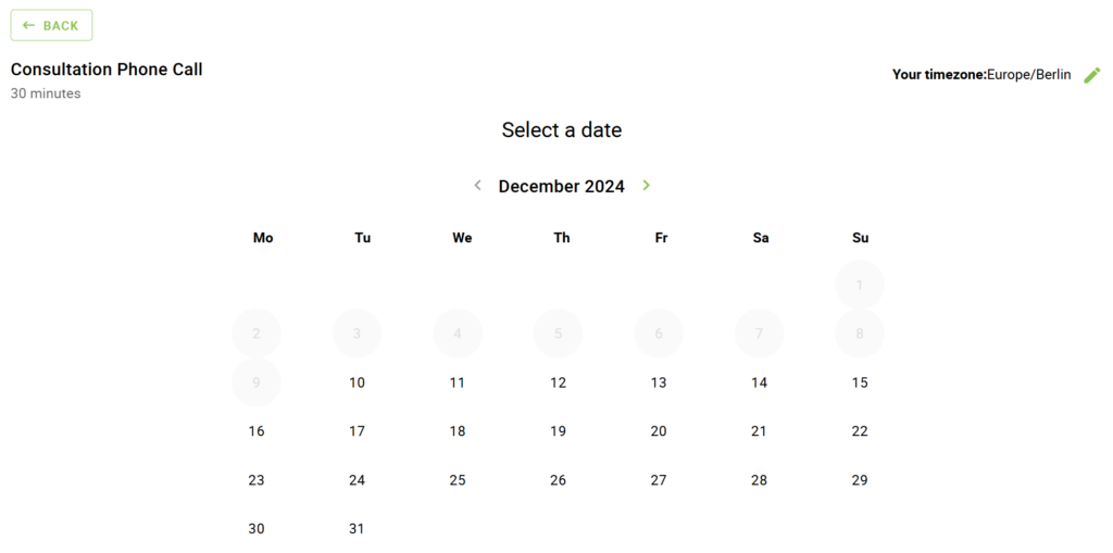
The Only Available Dates View is similar to the Weekly View, but it is going to exclude listing any days that don’t have any open time slots. This is great for anyone wanting to hide weekends in the Weekly View!

Time View
Adjust the content layout of the Time View in the booking form.
Time of Day Columns
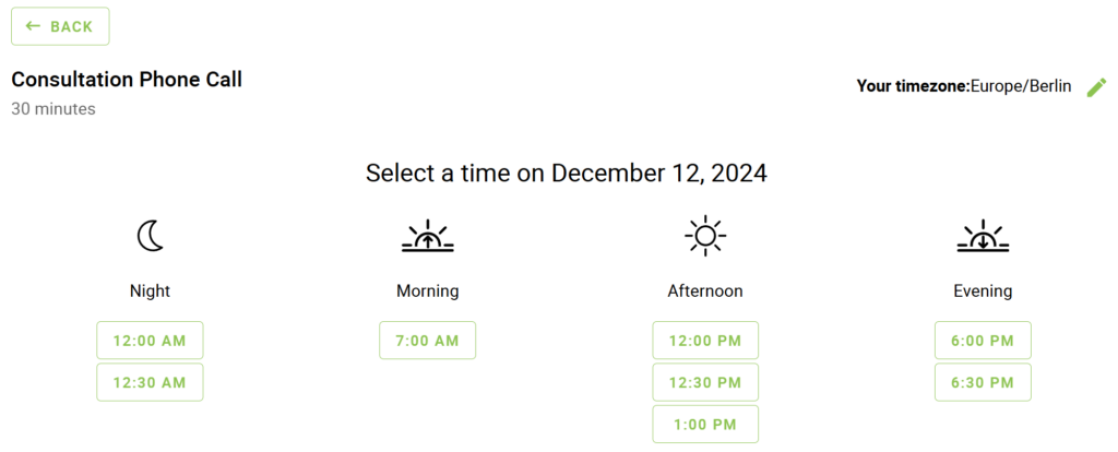
The Time of Day Columns View is best when you have a larger number of time slots throughout the day. The time slots are split up into four columns for Night, Morning, Afternoon, and Evening.
Single Column
The Single Column View is best when you offer a few time slots per day and want to display a minimal layout. The time slots are shown in a single vertical column.
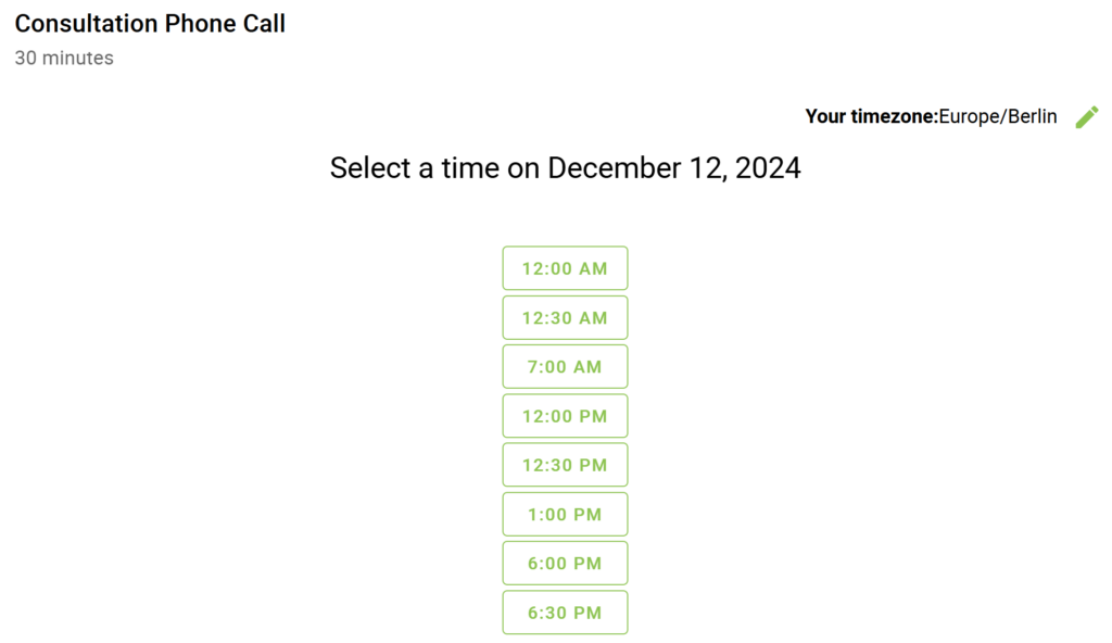
Rows
The Rows View allows you to display the time slots in neat rows organized by the Time of Day sections (Night, Afternoon, Evening, Morning). This is an excellent view for booking calendars that are placed in long vertical sections on a web page.
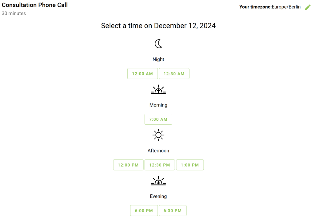
Block
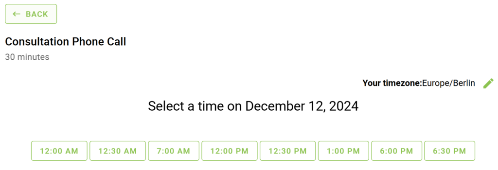
The Block View allows you to display the time slots in left-to-right order, taking up as much space horizontally as possible before starting a new line. This is a good option for booking calendars that want to keep it simple. Removing the Time of Day sections helps some schedules avoid ending up with sparse columns due to limited time slots.
